Key performance indicators are essential metrics that provide organizations with a clear measurement of their progress toward strategic goals. By providing quantifiable data, KPIs enable businesses to assess real-time performance, identify potential problems, and align their efforts with long-term objectives. These indicators enable decision-makers to navigate challenging business environments by focusing on the metrics most significantly impacting profitability, growth, and operational efficiency.
KPIs act as a guiding compass for organizations through several business challenges. Whether you want to monitor operational efficiency, financial health, or marketing and sales performance, KPI dashboard metrics provide critical insights to help make informed decisions. KPIs transform large amounts of data into actionable insights, making them indispensable for daily management and strategic planning. Let’s take a look at five examples of KPI dashboard metrics:
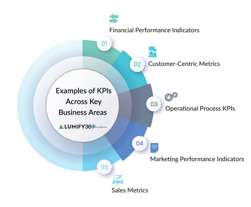
Examples of Key Business Area KPIs
Key performance indicators (KPIs) are vital in tracking improvement across several business functions. The following sections explore how KPIs are used across key business areas to drive growth and performance.
Financial Performance Indicators
Financial performance is critical in business. Financial KPIs offer key insights into an organization’s efficiency, profitability, and stability. These key performance indicators assess past performance to guide future business decisions. Here are some of the most common financial examples of KPI dashboard metrics:
- Return on Investment (ROI): ROI measures the return or benefit gained from an investment relative to its cost. While it is often used to calculate profitability, ROI can also assess the effectiveness or efficiency of various investments or initiatives. It is calculated by dividing the net benefit (profit, cost savings, or other gains) by the investment cost and multiplying by 100.
- Net Profit Margin: Net profit margin measures the percentage of revenue that remains as profit after all expenses—including operating costs, taxes, and interest—have been deducted. It is an important indicator of a company’s overall profitability and financial health, showing how much profit is retained from total sales.
- Gross Profit Margin: Gross profit margin represents the percentage of revenue remaining after deducting the cost of goods sold (COGS). It explains how efficiently a company manages its production or acquisition costs. A higher gross profit margin indicates that a company retains more revenue from each sale after covering the direct costs of producing goods or services. This makes it a valuable KPI for assessing the efficiency of production processes and cost management and a widely used metric in our example KPI dashboard.
Customer Success Metrics
Understanding customer needs and behaviors is critical to sustaining growth in a competitive environment. Customer-centric KPIs help businesses gauge how well they meet customer expectations and enhance customer loyalty. These KPIs focus on customer experience, satisfaction, and the relationship between the company and its clientele.
- Customer Satisfaction Score (CSAT): The CSAT is a simple but effective example of a KPI dashboard metric to gauge customer satisfaction with a service, product, or experience. Typically, this score is calculated through surveys asking customers about their satisfaction on a scale of 1 to 10. A high CSAT metric shows the customers are happy with what the company is providing, whereas a low score shows the areas for improvement.
- Customer Retention Rate: Customer Retention Rate measures the percentage of existing customers that a company retains over a given period. It is calculated by subtracting the number of new customers acquired during the period from the total number of customers at the end, then dividing by the number of customers at the start of the period and multiplying by 100. A high CRR indicates that the company is successfully maintaining long-term customer relationships. The CRR is a common example of a KPI dashboard metric.
Operational Process KPIs
Operational key performance indicators measure the efficiency and effectiveness of an organization’s internal procedures. Such metrics enable companies to identify bottlenecks, enhance workflows, and improve productivity. Operational KPIs are commonly used in logistics, manufacturing, supply chain management, banking, insurance, and financial services – anywhere efficiency can significantly impact profitability.
- Employee Turnover Rate: This metric shows how often employees leave a company within the specified period, generally presented as a percentage. The high turnover rate may show dissatisfaction with the work management, compensation, or environment, whereas the low turnover rate shows that the company is successfully retaining talent.
- First-Time Right (FTR): This KPI calculates the percentage of methods or products appropriately accomplished the first time without any rework or errors. A high FTR rate signifies that operations are running smoothly and efficiently, reducing waste and costs associated with defects or corrections. It is an example of a KPI dashboard metric used in large organizations.
- Cycle Time: Cycle time calculates how long it takes to accomplish the procedure from initial to end. This KPI is generally used in production and manufacturing environments to monitor the efficiency of processes like order fulfillment and product assembly. Shorter cycle times typically indicate more efficient processes, while longer cycles may suggest inefficiencies that must be addressed.
Marketing Performance Indicators
Marketing KPI dashboards help companies measure the effectiveness of their promotional activities and evaluate whether marketing campaigns achieve desired results. These metrics are critical for understanding campaign performance, contribution to the sales pipeline, and the return on marketing investments.
- Cost Per Lead (CPL): CPL measures the cost of acquiring a potential customer through marketing efforts. It is crucial for budgeting and evaluating the efficiency of marketing campaigns. A low CPL indicates that the business generates leads at a low cost, which is particularly important for companies that rely on a high volume of leads to drive sales. Marketing organizations often evaluate CPL KPIs for different buyer journey stages. For example, a subscriber or lead may have a low CPL target, while a B2B SaaS product demo request may have a higher threshold. Because CPL varies depending on marketing channels and objectives, it is a great example of a KPI dashboard metric that can be displayed and drilled down in different ways.
- Conversion Rate: Conversion rate measures the percentage of users or leads who complete a desired action out of the total number of visitors or potential customers. Common conversions include purchasing, signing up for a newsletter, or filling out a contact form. It is calculated by dividing the number of conversions by the total number of visitors or leads and multiplying by 100. A higher conversion rate indicates that the marketing efforts and user experience effectively drive desired outcomes, making it a critical metric for evaluating campaign performance and optimizing strategies.
- Click-Through Rate (CTR): CTR is a crucial example of a KPI dashboard metric that measures the percentage of people who click on a specific link out of the total number of people who viewed the link, such as in an email, advertisement or webpage. It is calculated by dividing the number of clicks by the number of impressions (views) and multiplying by 100. A high CTR indicates that the marketing message is effectively engaging the target audience and motivating them to act, making CTR a key metric for evaluating the performance of digital marketing campaigns.
Sales Metrics
Sales Key performance indicators are essential for tracking the performance of a business’s sales force and guaranteeing that revenue targets are met. These metrics help organizations understand how well their sales strategies are working and identify areas for improvement.
- Sales Growth: This metric calculates the increase in sales over a specific period, often compared to the previous period or year. Sales growth is a crucial indicator of a company’s market expansion and ability to capture more customers. An example of a KPI dashboard that evaluates sales growth may show growth by channel, short and long-term periods (quarters versus year-over-year), and growth by product type.
- Lead-to-Sale Conversion Rate: This KPI tracks the percentage of leads that result in a sale. It helps businesses understand the efficiency of their sales pipeline and identify any weak points where leads might be dropping off. A high conversion rate indicates a robust sales process, while a low rate may require re-evaluating lead qualification and nurturing strategies.
- Average Deal Size: This metric measures the average value of all closed deals. It allows companies to understand the size of their deals and determine whether to focus on increasing deal size to boost overall revenue. One example of a KPI dashboard can show average deal size across sales channels, for example, direct sellers, channel partners, upsell teams, and e-commerce.
Sign up for Industry Insights and be the
first to know about Lumify360’s enhancements!
Empower Your Business with Business Analytics to Improve KPIs and Predict Success
As businesses increasingly rely on Key Performance Indicators (KPIs) to drive performance, Lumify360 offers a modern solution to enhance decision-making. Lumify360 transforms siloed and unstructured data into real-time, actionable analytics enriched with external market data, empowering mid-market business executives to predict KPI performance confidently.
An integrated BI platform empowers users to independently explore data, create visualizations, provide many examples of KPI dashboard metrics, and identify trends without needing data analysts or separate applications. Executives can build interactive KPI dashboards and embed them in Office365 applications like PowerPoint, making sharing findings across the organization easy.