Successful organizations leverage their data to stay competitive by relying on key performance indicator (KPI) dashboards. KPI dashboards have become invaluable assets for companies seeking to maintain an edge, offering a powerful way to visualize and interpret critical metrics. By transforming raw data into actionable insights, KPI dashboards enable decision-makers to track real-time performance, make data-driven decisions, and confidently support strategic initiatives.
A KPI dashboard provides a comprehensive and centralized view of critical business information, eliminating the need for complex reports and time-consuming manual data analysis. Creating a KPI dashboard streamlines decision-making and offers clear, actionable insights. With the ability to monitor and measure performance across different departments, such dashboards help align teams around shared goals and drive the company toward its objectives.
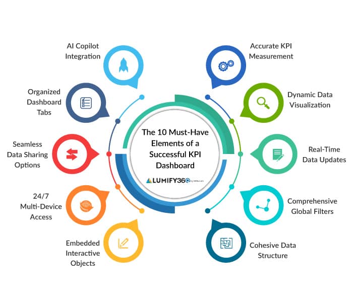
The 10 Elements
An effective KPI dashboard is more than just a collection of data points. To harness your data’s power and drive business success, a KPI dashboard must incorporate key elements that enhance its functionality, usability, and impact. Here are the ten essential elements that every successful KPI dashboard should include:
1. Accurate KPI Measurement
The foundation for creating a KPI dashboard is accurate measurement of the key performance indicators. This is critical to ensuring that monitored metrics are measured consistently and precisely. Accurate KPI measurement enables businesses to track progress, evaluate strategies, and adjust when required.
2. Dynamic Data Visualization
Data visualization is vital for making complex information understandable and clear. An effective KPI dashboard should offer dynamic visualization options that enable users to view data in several formats, such as graphs, charts, and heat maps. This flexibility is essential in creating a KPI dashboard, allowing users to choose the most relevant visualization for their data. Additionally, it helps compare metrics, spot trends, and communicate findings effectively.
3. Real-Time Data Updates
In today’s fast-paced environment, outdated information is of little value. A well-designed KPI dashboard must provide real-time updates, allowing users to always have access to the latest information. This capability is essential for timely decisions, particularly in sectors where situations change quickly. Real-time data processing enables organizations to respond proactively to emerging opportunities and challenges, maintaining a competitive edge.
4. Comprehensive Global Filters
When creating a KPI dashboard, ensure it offers comprehensive global filters, allowing users to customize their data view. Whether filtering by period, department, product line, or other variables, global filters enable users to drill down into specific data sets without navigating away from the main dashboard. This functionality saves time and enhances the dashboard’s usability by making it easier to access relevant insights quickly.
5. Cohesive Data Structure
A cohesive data structure is the backbone of a successful KPI dashboard. This involves seamlessly integrating and aligning data from various sources, such as data lakes and warehouses, into a unified system. When creating a KPI dashboard, a well-organized data structure ensures that all metrics and KPIs are accurately represented, easily accessed, and analyzed. By having a cohesive structure, businesses can eliminate data silos, reduce inconsistencies, and enhance the reliability of their insights.
6. Embedded Interactive Objects
Interactivity is a crucial feature of a modern key performance indicator dashboard. Users can explore data in depth without overwhelming the main interface by embedding interactive objects such as clickable charts, drill-down menus, and hover-over details. These interactive elements make it easier for users to investigate specific aspects of the data, uncover insights, and make more informed decisions.
7. 24/7 Multi-Device Access
In an increasingly mobile world, a KPI dashboard must be accessible anytime, anywhere, and on any device. Whether on a desktop, tablet, or smartphone, users should be able to access their dashboard seamlessly. This 24/7 multi-device access ensures that decision-makers stay informed and responsive, regardless of location. It also promotes a culture of continuous monitoring and engagement, where insights are always available to those who need them.
8. Seamless Data Sharing Options
While creating a KPI dashboard, consider including data-sharing options to foster collaboration. Whether through email reports, direct links, or integration with other software platforms or programs, such as Microsoft Word and PowerPoint, the ability to share insights instantly ensures that everyone in the company stays aligned.
9. Organized Dashboard Tabs
As businesses gather and analyze more data, the risk of information overload increases. A successful key performance indicator dashboard should include organized tabs that enable users to categorize and separate different kinds of data. For example, one tab could focus on financial metrics, another on customer satisfaction, and another on operational efficiency. This feature ensures users can quickly find the information without sifting through unrelated data, enhancing usability and focus.
10. AI Copilot Integration
Integrating an AI copilot into your KPI dashboard takes data analysis to the next level. An AI copilot can assist users by querying underlying data and generating on-the-fly charts and graphs, providing instant visual insights. This feature transforms the dashboard from a passive reporting tool into an interactive, intelligent assistant that helps users explore data more effectively. By leveraging AI, the dashboard can suggest relevant data points, identify patterns, and predict future trends, making it easier for decision-makers to act quickly and strategically.
Sign up for Industry Insights and be the
first to know about Lumify360’s enhancements!
Maximize KPI Accuracy and Predict Performance with Business Analytics Software
To fully unlock the potential of your KPI dashboard, it’s essential to harness advanced business data analytics software that improves accuracy and provides predictive insights. One such solution is Lumify360, a modern data analytics platform that empowers mid-market business executives with enriched, predictive KPIs.
Lumify360 excels at transforming siloed and unstructured data into real-time, actionable analytics. With Lumify360, you don’t need to worry about creating a KPI dashboard from scratch; —interactive dashboards are created seamlessly without requiring separate applications. This capability is vital for organizations that must make informed decisions based on accurate, up-to-date information. By integrating external market data, Lumify360 enriches the analytics, providing a comprehensive view beyond internal metrics. This holistic approach allows executives to predict KPI performance more confidently and precisely, enabling proactive strategy adjustments. Incorporating Lumify360 into your KPI dashboard strategy ensures your data is accurate, enriched, and predictive.